
This is a story of how I increased my conversions by 200% by making my sign-up form easier to use and having more of them on the site.
Design vs. Sales
The stereotypes of the sales person and the designer are of two totally different animals.
Sales people, on one hand, are grubby desperate types who like garish colors, big headlines and obvious sales copy.
Designers, on the other, are aloof, creative souls who wince at unsubtle sales pages – they even get upset at the use of a certain font in a movie (Papyrus in Avatar).
The problem with the sales person
 The sales person just wants sales. If something works, if it has been proved to sell more or convert more, it’s used. So we get a proliferation of pop-ups, animation and repetitious sales copy.
The problem with the designer
 Designers like white space and they like to de-clutter. Sometimes they set type so small that older people or people with poor eyesight will have trouble with reading it. This is because designers often have very good eyesight.
So when a designer has finished a design, it must be understood by the general public, not just by the designer and the client.
The happy medium
Two of the most important characteristics of the sales process are clarity and usability.
I have a great example of this here on my blog and I’m so ashamed that it took me so long to work this out.
My shame: number one
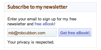
 On my website I have a form to take visitors’ email addresses so that they can receive newsletters and a free eBook on How to Market Yourself Online.
When I first put the form on the website I put it on one page only – the page that advertised the eBook and left it at that.
I was looking at my site too hard and too much. I forgot that most visitors look at it for only a few seconds.
One day I wondered to myself, “what would happen if I put a sign-up form on the sidebar”. I’d probably noticed that sign-up forms were there on lots of other sites.
“But,” I thought, “it probably won’t make much difference as visitors can follow the links to the sign-up page because they will want to read more about the newsletter and incentive first.”
Wrong! My subscriptions increased by 100%
My shame: number two
But there’s more. I used to have a field for the first and last name on my form on the email company’s site. I quite liked having it there as I could start my emails “Dear so-and-so” which makes them nice and personal.
The first name field wasn’t required and so didn’t exist on the form on my site so you got an annoying pop-up form when you signed up. I didn’t worry about this for months and months as I thought my visitors wouldn’t mind the extra click at this stage.
Wrong! I got rid of this annoying, unnecessary barrier to the sign-up process and “¦ my subscriptions increased by 100% again.
Keep it simple, stupid!
I really should have know better.
Don’t put any barrier, confusion or unnecessary distracting element in your designs. Perfect design, so the saying goes, is when nothing needs to be added and nothing needs to be taken away.
What do you think?
Have any of you got a sign-up form on your website? Or have you signed up to a newsletter on a website? (I guess that would be most people!) What do you think of the sign-up process here? Is there anything that can be done to improve it here or on your website?
This is a very interesting subject. I’m currently split testing the sign-up squeeze page and I’m getting some interesting results that I will share with you shortly.

I agree that most sales people only thinking of sales without pay much attention on technical aspects how to get them. Your article make me think twice about my movements. Thanks!!
Glad that the article made you think, usahawan, I can’t receive a better comment than that 🙂
Great article Rob! It’s something we instinctively should know but still needs to be made painfully obvious! why is that? Also, your next challenge – should you wish to accept – is how do we efficiently collect more in depth info from our customers once they’ve signed up.
Hello Ali, long time!
Yes, it was painfully obvious, but how many times do we miss something that’s staring us in the face when we’ve been looking at something too long?
And, yes, I’m always asking here for info from people and I ask on my newsletters about what people would like information on. The answers are interesting but I would always want more!
This is helpful information and timely, as well. Just this morning I tried to get some information from the US Postal Service site, ended up filling out several forms (and I assume subscribing to something), and then realized that the information I was trying to get to was of no use to me. That just made me mad! So, the fewer hoops to jump through, the better!
Thank you, Anne, it shows you that you have to be so careful with how you interact with the public and get it to be as simple as possible.
Rob, I love your articles! I got started with MailChimp by following your articles. Love your analyses of the sales person (huckster?) and designer, and the photos. Keep up the good work!
I’m a dunce and I don’t see how to add copy (like you have) to the MailChimp widget. Can you point me to that info? (the site where I have the widget is)
Thanks Louise, about the sidebar sign-up form. I’m afraid you may be stuck with just the email input and button. In order to add a line in there you will have to read my other article on getting the code from MailChimp and pasting it in.
Great article Rob, the smallest things really do make a difference. I agree with you that designers who overdesign their pages to reach some unattainable peak of perfection are the worst. A site should always be designed with usability in mind – if that means “dumbing down” a site so it is accessible to, say, older people with poor eyesight or folks on slow internet connections or people on low powered netbooks, then so be it.
I can never understand why some websites have a need to cram so much crap (mainly Flash and JavaScript) to make my CPU spike up to 90%. Things like that don’t add anything to the user experience and just annoys people.
Thanks Alex, that’s a really good point about CPU, most designers use extremely powerful computers that can handle all the bells and whistles and it’s important to test a site on a cheap laptop with a dialup connection to see how it works!
Thanks for mentioning those of us in the 55+ bracket without perfect eyesight. 8) Long time pet peeves re websites of any kind:
Black backgrounds! Ugh! with white or red or yellow/gold text! Impossible! (horrendously ugly. Why do so many males think a black website is cool? I’ve never in 11 years online seen a female chose a black website background.)
Invisible grey text ANYWHERE on the site. Also impossible! Who invented that cruel idea?
Forced-on-us mobile sites with no way to access the full site. Grrrrr.
Blinking Flashing Popping-Up anything. Period! So tacky & gawdy! (as bad as a used car salesman late night infomercial, lol)
Forms that are too nosey & want TMI.
•Whatever it is, if it won’t work on iphone Safari, don’t put it on your site! The world is going mobile! (this doesn’t mean we want scaled-down & stripped mobile versions either. Give me a full site any day that works 100% from iphone via pinch/zoom, etc.)
Verdana is the BEST readable font of all time. Never Ariel, ugh! ugh! For something a little fancier, Georgia is my next fav, looks great in italics.
Comment sections of a site that make you log in just to comment. No thanks. What an extra hassle. (That’s what I like about WP. Great Comment sections though the text is a bit small!)
Comment Sections — like Blogger’s — that won’t let me copy/paste a comment I first composed in iphone Notes app. I abandoned my Blogger blog for that reason (since I like to add follow-up comments to posts & it won’t let me copy/paste). WP wins again.
Like most of you agreed, crisp, clear, clean, uncluttered, non-flashing, non-hideous colored websites are my favorites. And I spend a LOT of time online! 😉
Hey MC, thank for your comment. It’s amazing how many sites still have text that is hard to read – whether it’s a color that’s difficult to read on a background or whether the font size is too small. I’m never keen on flashing on a web page. A lot of your pet peeves are the same as mine and the answer to them is to create a site with the user in mind – test, test and re-test the UI. The only thing I’m not 100% with you is Verdana – I’ve always preferred Helvetica!
Hmm, Helvetica. In a larger font size I’m sure I could learn to like it. 😉
It takes techie know-how to build websites & the techies may not also have a creative streak as far as design, color, layout, etc. If it is guys mostly doing the technical end (all that coding, ugh, makes my brain hurt), they should ask their lady friends for advice on color.
As for design & layout, I’m from the old school newspaper (before computers): paste-up, lay-out, light tables, wax machines, X-Acto knife, etc. When I see news sites or blogs with the object/subject of a photo facing off the page vs. facing inside the page toward the text, I still cringe. 🙂
Hey, MC, I used to work at newspapers. You’re right that people who are good at creating the technical back end of sites aren’t necessarily good at designing sites.
Hi again Rob, Agreed. It takes two to tango… we couldn’t have websites & blogs w/o those gifted techies who have a mind geared toward the technical backside of things. The rest is window dressing but also very visually important.
And now you’ve really tickled me… a fellow former newspaper hound. How cool is that! 🙂 Best job I ever had, loved having a “hands on” finished product every week as “concrete evidence” of the “fruit of our creative labors.” Very satisfying for the soul! It was just last week I learned, sadly, my former boss there died earlier this year @age 87. Even though I was just a “blip on the screen” during his 38-years of owning the paper, he himself was quite the icon for a “small town” owner/editor/publisher (he was in his 50’s when I was there). If you enjoy the newspaper business, you may enjoy reading about his editorial influence & accomplishments. He was quite the “colorful character” & a great boss:
2/27/11:”Aspen icon Bil Dunaway dies at 87: Newspaper publisher, WWII veteran and mountaineer helped shape Aspen”
3/6/11: Â “A tribute to Bil Dunaway” – The Aspen Times:
http://www.aspentimes.com/article/20110306/ASPENWEEKLY/110309913&parentprofile=search
5/3/11: Â INC.com: “Obituary: Bil Dunaway, 1923-2011”:
http://www.inc.com/magazine/20110501/obituary-bil-dunaway-of-the-aspen-times.html
Is your “newspaper alma mater” in England? (If getting too off-topic, I understand!)
I worked on two national newspapers here in the UK (The Independent and The Guardian) in the early nineties when they were going from black and white to colour and struggling with DTP – as it was called in those days. I worked on the picture desks. I found them stifling environments as I was only in charge of one little cog of a big machine whereas now I create the whole machine. But I miss the “hands-on finished product”.
Bill Dunaway looks an interesting character – I should strive to have a colorful life like his. I have been to Colorado once as well, very beautiful state.
Wow, you really were in big publisher cogs! Nationals! Color printing really was a big deal in those days, we only had color on the front page of each section. And DTP, had to stop & think, lol, desktop publishing, almost forgot. None of that in the 70’s… I also did typesetting (body copy only, as headlines were done on a different machine by a different lady). We typed on “paper tape” machines that punched holes in the big roll of paper attached to the typing machine (which had no display screen so you could not see what you were typing) & that now-full-of-holes-paper roll was fed to a giant-box-shaped Merganthaler computer which then spit out the column-sized strips of printed text that got waxed & pasted onto the pages (after the proofreader lady read them all first!)
We’ve come a long way, indeed, as you say, as now you are your own boss, writer, editor, typesetter, headliner, proofreader, pasteup artist, & publisher! 🙂 And I’m typing this on a hand-size miracle gadget (iphone) with virtual keyboard that can “talk” to your “personal publishing empire” instantly, as soon as I hit the WP “Publish” button. 🙂 All amazing advancements. Thanks for the great memories.
I haven’t had the pleasure of visiting your country. Glad you liked Colorado, truly beautiful & loved the No Humidity! (unlike where I am now, South USA). Take care!
Wow, MC, you really are taking us back in time but seeing how things have changed in such a short space of time is really amazing. I’m really pleased you’re commenting here through an iPhone. I hope this site is working OK on a handheld.
Your insights are fascinating. You should blog!
I hope you’ve had a good summer there were you are.