Here is our third Design and Marketing Podcast where we welcome back Tara Roskell, who we featured on our first podcast, to talk about designing logos. Tara and I have been “blogging buddies” for a long time, by the way. 🙂
Tara, a highly experienced graphic designer, has a hit course on Udemy called How to Design a Logo – a Beginners Course. The course shows you how to design a logo from brief to completion. Tara actually takes a logo design brief from a client on Skype and then breaks down the whole process into simple steps.
I have read many books on design and done many courses, but I haven’t seen “designing” broken down into a step-by-step process in this simple way before. If you follow these steps every time you design a logo you will come up with more ideas and are likely to have a better end product. The logo course may be for beginners but I think designers with many years experience will find value in her course.
Both in Tara’s logo course and the above interview there is information on the following. The process is gone into far more detail in Tara’s course than we do in our short interview.
How to generate initial ideas
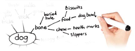
Tara and I are both devotees of mind-mapping when trying to come up with logo ideas. Tara talks extensively about her mind-mapping technique, which she uses for word associations and visual connections. Tara also talks a lot about doing mood boards.
How to use sketching to get your ideas down quickly
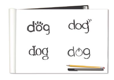
A lot of great logos come about as a result of sketching various ideas. Lots of great ideas can come this way. Tara talks in her course about not only sketching out ideas with text but also finding and sketching different symbol ideas. She also really breaks this important process down to include many different ways of doing it to generate new ideas.
About different fonts
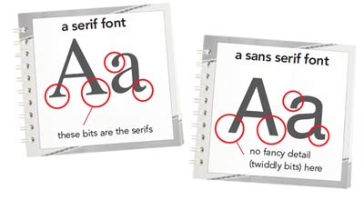
We didn’t talk too much about fonts in the interview but Tara explains how she goes about choosing them for the logos she designs and her favorite places to find good typefaces.
Putting it together
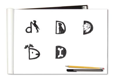
In her course Tara explains all the different ways to sketch a logo: combining two or groups of letters, type positioning with symbol based logos, the use of geometric shapes, working with a single letter to form an icon and other ways you can put the logo together.
Tara stresses that it’s always important to consider every type of logo during this stage as otherwise you could miss that “killer idea”.
About different color options
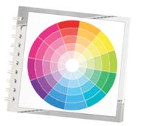
In the course, she talks about color theory as well. She explains how to experiment with and choose colors or combinations of colors.
How to work up the best ideas in Adobe Illustrator
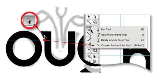
This is the very important stage of turning your sketches and scribbles into perfect vectors in Illustrator. There are some alternatives to Illustrator but the important point is to work on logos digitally in vector not as bitmaps!
How to send the ideas to the client

Finally we talk about how to send the ideas to the client … and the dreaded client feedback. What to do if the clients says, “I don’t like any of them!” (This doesn’t often happen!)
Tara Roskell’s Logo Design Course
The course, entitled How to Design a Logo – a Beginners Course, already has over a thousand happy students. It has the maximum 5 stars after 29 reviews on Udemy!
This course also includes a bonus 60 page e-book guide of how to design a logo including warm up exercises and a sample logo project. There is a 30-day money back guarantee. And the one-off payment gives you a no limits lifetime access. You can ask a question at any stage of the course and Tara will answer it personally.
But wait, there’s more! If you want to get a 51% reduction on the course (and who wouldn’t?) get this coupon / redemption code: robcubbon22 and paste it in on this page here – and you’ll only pay $22 instead of $45!
That’s $22 for over 41 lectures and 2.5 hrs of content, all with Tara’s unique expertise!
If you purchase the course through any of the links on this page or with the redemption code, I may receive a commission. However, I’ve seen the course and I wouldn’t feature the course so prominently here unless I thought it was really good. I don’t care how long you’ve been designing logos, the course will give you tips that will ultimately make you design better logos!
And, as Tara has often said to me, there are a lot of design courses out there about software, but not so many that explain the design process. In this course Tara breaks down the design process and she’ll make you realise how many stages you’d been leaving out!

Great article Rob,
i think we have fallen into the trap of making logos in bitmap?
i find sitting and sketching really helps get the logo ideas out rather than going straight into illustrator and build them, you end up spending triple the time revising it as you go without preparation.
Thanks, Scott. Tara and I are both from print design backgrounds and that’s why we’re really vector oriented. The thing about vectors is that they can get passed from application to application and scale up and down and up again and never lose their quality. A JPG image or even a PNG doesn’t have that flexibility.
Tara’s course is great for reminding you of these time-saving tips.
yes i really was learning the hard way, i used to use Photoshop for everything. Even through my Graphic Design course (i wont put how many years ago as it makes me feel very old) i decided that there was no point using any other software other than Photoshop as you can do it all in one place….. HOW WRONG WAS I!!! lol
over the last year i have been getting to grips with Adobe Illustrator and Indesign.
maybe a good blog topic there Rob?
-What types programs to use and why
Tara i will be looking into enrolling to your course, i could do with some expertise in the logo design field. i sometimes struggle with logo creation, which is something i would really like to over-come.
Yes, that’s certainly a good idea for a blog topic – when to use Illustrator, Photoshop or InDesign.
I guess, if you’re only going to use a logo for a blog and nothing else then Photoshop would be OK but if it’s then wanted for a business card you’ll have to re-do it!
If you do decide to enroll on the course remember to use the coupon/redemption code robcubbon22 to get 50% off! And let us know how you get on.
Hi Scott and Rob, Illustrator for me all the way. If it’s just a logo which is going to be used for web you can get away with Photoshop, but for print I think a vector version is really important, plus illustrator is easier to amend. I also use illustrator for illustration which I then take into Photoshop – I find it much easier to draw and make amends in illustrator then you can save out as a psd and illustrator will maintain all its layers for further work in Photoshop. Good idea for a topic Scott – over to you Rob 😉
Thanks, watch out for “Illustrator, Photoshop or InDesign – Which Should I Use?” coming soon! 😉
Yes i am really trying to kick the habit now and purely work in Illustrator for Logo design.
i have also been getting a lot of requests for 3D logo design which i create in Illustrator then export paths to Cinema 4D and build them from there. It seems to be a very popular style for the Nightclub/Rave Flyer customers i have.
Rob i will be taking advantage of that coupon,
Tara i look forward to learning from you, hopefully i will enrol in January/February 🙂
Hi Scott, I have never tried a 3D logo using 3D software – sounds interesting – maybe you could write a blog post on that 🙂 , do you animate them too? I would definitely be interested in reading. Hope to see you early next year.
It is definitely a learning curve to work out the 3D software, but its really effective on flyers and posters as it gives it that extra dimension.
here is an example of one on a a flyer:
http://www.theflyermaster.com/wp-content/uploads/2012/06/RAW-ELEMENTZ-FLYER-dl.jpg
Yes i will be doing a blog post on this for sure 🙂
I would say that logos for club flyers are probably better off done in Photoshop although you may find it useful to start off in Illustrator for the main shape. It’s horses for courses.
Nice flyer, Scott!
Great – I look forward to reading. I use Cheetah 3D, but for packaging and 3D visuals.
That’s definitely an interesting looking course. Would you say anyone can be taught to design good logos though? I would think that it’s somewhat a case of either you’ve got it or you haven’t. I’m sure it’s possible to improve someone’s ability at designing a logo from bad to not too bad, but no-one really wants a not too bad logo.
I agree with Tara, Mark. I think graphic design can be learned to a certain extent but you have to be patient and be prepared to put the hours in. However, this is a controversial subject as some designers believe only in talent, whereas I believe talent is only a small part of a designer’s success. I wrote a post on this about how to learn how to design and there were other points of view in the comments.
Hi Mark, I think anyone can learn to design a logo if they are prepared to put the time in. It is like anything the more you practice the better you get. The course aims to give you a headstart by taking you through a process that will help you think of more ideas and teaches you step by step the process that I use. I know many designers use a similar process.
Not sure, but I think a very important point is missed here. You need to research and check against registered logos before developing on paper, otherwise later you many find your client cannot use their logo for copyright/register and trademark reason. I am speaking from my time working for a brand consultant in the past.
I agree with Tara, Simon. I have had experience with trademark registration and it’s a long drawn out process that is mostly the domain of larger organisations. But definitely something we need to know about.
Hi Simon,
You make a good point. It is a good idea to advise a client before you start, that they need to check the actual name they have chosen is not already being used in the same market. Trademarks are so specialist that although you check yourself it is really advisable to get in a legal expert for this, there is so much to it. What class the trademark should be in how it will be used, whether it will be used internationally etc. Plus trademarks that are not yet published for review won’t show up in the public database. Even after all that it doesn’t stop someone who has an unregistered mark from staking a claim against a registered one if they can prove they have been using the mark in the market for a significant amount of time etc.
What amaze me is that some claim to design a logo in a few hours. As I believed in the old-fashioned way to design possible a few days or weeks with Adobe Illustrator. You need feedback from your clients, colleagues, etc.
When designing a logo you must think about the smallest size possible, it could be 20mm, you need to ensure that the logo is readable at this size. I have come across logos that look fine for around100mm wide or high but reduce down to 20mm it becomes an unusual shape or form even a solid shape – completely different from the 100mm logo!
Once the testing been done, it is a good idea to draw up the final logo at 100mm or 200mm wide or high in Illustrator, the reason if you reduced it down in percents it makes your job easier you can work it out. You if you reduced a 100mm logo down 50%, it will be 50mm or 200mm down 50% will be 100mm.
A logo “designed” in a few hours isn’t really a logo, it’s just treated type, basically.
Yes, Simon, logos need to look great very small and very big – very difficult.
Hi Simon
I agree. I like to spend at least a day minimum coming up with initial ideas (after research). Of course people don’t actually see all the back work that goes into it. Of course there are times when you hit on the idea that is chosen quite quickly, but then it is still good to explore other options. It is definitely a good idea too like your suggestions to see what the logo looks like at different sizes.
What’s good about your course, Tara, is that it gives us the framework and the process to do all these different things that do take time and ensure you give the client and the logo the attention they deserve. (Did that sound a bit crawly?)
Good instructions for beginners. I appreciate it 🙂
Thank you!
Only half-way through, but I simply must comment RIGHT NOW:
Rob, you said you send your clients your suggestions as small images on a big blank page.
Now, as an opinionated bastard of a consumer (who would love to have the time and skills to do this myself, or the money to pay for really top-notch graphical talent, but who has neither) this would infuriate me!
Why? Because when a logo is in use it will virtually never be seen in that environment. It will be on letterheads, signs, shopping bags, business cards and stuff like that. It won’t be hanging on the wall with a nice passepartout around it!
If you show it to me like that, I will also “see” the blank space around it, and not be able to gauge how well it will actually work.
A first proposal without context is fine, but what you are talking about runs the risk of creating a “context” that will skew the clients less-trained eye, ultimately resulting in something that will not be very long lived (because to the client it will always look kind of “wrong” in more mundane surroundings).
Sorry, as I said, opinionated bastard, and probably a nightmare of a client.
Back to listening – more (much more) later.
We like opinionated bastards here, Tona! Yes, I usually make the point (although maybe not in this podcast) that a client that asks just for a logo is a “red flag”. It can be that the client doesn’t know what they’re doing. It is essential to know what the logo is for. Good point!
Very interesting podcast (and the rest of your site/blog looks interesting too), thanks for doing this!
But as the opinionated bastard of a nightmare client that I am, I am deeply disappointed in one thing:
You didn’t at all talk about the importance of sussing out how the client will _use_ the logo. I am guessing it is in Tara’s interview/brief/questionnaire at least to some extent, but I was hoping for even a little discussion about it.
I see so much graphic design (and especially logos) that is just short lived “consumables”, and it makes me angry. From the other side of the table I know how infuriating it is to work with custom graphic elements that look like shit unless paired with exactly the right font or printed at exactly the right size and colours.
Oh, and talking about colours: you should really, really try to convince your clients to choose a logo that works well in black&white or gray too! Please.
I have seen too many small businesses (and organisations – there the problems can be even greater) either waste extreme amounts of time or do really hopeless kludges (including physical copy/paste!) due to choosing logos that are finicky about colour.
Another fact is that people *will* want to use your creation in ways you’d never think of – and they will usually try to do it themselves. Especially when working with small companies, without graphical skills in-house, I can’t stress how important it is that the final result can stand up to mishandling and technical limitations (forget anything that involves printing right to the edge of the paper! Forget it NOW! Forget anything that hinges on quirky, assymetrical or “creative” placement.)
Every time I see a logo, I try to picture it in the hands of someone quite computer-challenged, working with outdated tools. And so I get angry quite often (good thing I suffer from low blodpressure). Because lots of stuff will only look good when handled by professionals. Place it a bit wrong on an envelope or a web page and everything looks horrible.
/rant.
How you supply the logo is very important and can help ensure the client uses it correctly. If it’s a logo on a website, all well and good, the client can’t misuse that.
I often supply Word templates for letters which mean that the client can’t easily change the position of the logo or the safe area around it.
As Tara says below, sometimes you supply detailed guidelines for the logo’s use.
A lot of it is education/communication with the client about brand consistency. Sometimes what’s obvious to us as designers (don’t skew the logo, change the corporate colors) isn’t obvious to clients.
You’re right to flag this up as it’s a potential banana skin.
Hi Rob, thanks for taking the time to reply.
“If it’s a logo on a website, all well and good, the client can’t misuse that.”
LOL. No, ROFLMAO.
Stingy small biz buys a website design, including a logo. No further dealings with the designer that made that. Two years later they move to a new premise and want a sign… Goes to the signmaker with a screenshot from the website.
The most hopeless example of “overly designed” logo and graphic look I’ve come across was a building run by a non-profit, with several other small non-profits as tenants (and a few small for-profits too). Everyone was meant to use the snazzy logo.
Only problem was that it really only looked good on materials designed by professionals. You couldn’t just stick it on top of a newsletter or a flyer, it was extremely hard to combine with any other logo. It specified a horrendous pea-soup-y colour.
The thing about detailed guidelines is all well and fine if
a) you have an on-going relationship with the client, and is prepared to help with transitions from one version of Word to another.
or
b) the client is sufficiently graphic/computer savvy to actually be able to carry out the instructions, and deal with minor glitches themselves.
Hi Tona,
Thanks for your comment/rant 😉
Like you suggested I do ask the client where the logo will be used and I pretty sure Rob does too. If there is time and budget in the job you can also show how it would work on stationery or a specific item or two that a client suggests. Some larger clients will also request complete guidelines – what size the logo should be used on different items, where it should be placed, fonts, colour pallette, photography styles for the brand etc. In this case you try and reference as many different uses as you can. This is a job in itself. In this case a designer will often specify fonts that should be used with the logo and specify a common font for inhouse use (ie one that most people will have on their machine).
Regarding black and white logos, both myself and Rob and Many designers actually start designing in black and white so we know it will work that way first before trying out colour options.
In the end it is down to a good brief and what budget you are working with. Once the logo is finalized unfortunately unless the designer is working with the client on a long term basis, there is little we can do to control how the logo is used.
Hi Tara, thanks for the comment.
You are so right that it is down to the brief and communication – but unfortunately most people/businesses/organisations are absolutely crap at a) thinking things through, and b) presenting their thoughts in a concise way.
I am absolutely not a fan of design (especially logos) that hinges on very precise requirements wrt placement, colours etc – IMNSHO that makes for a “consumable” design. Which is great news for graphic designers, of course!
But not so good for the client, since refreshing one’s graphical image takes time and money. And dilutes brand recognition – which is something that also affects the clients customers, creating annoyance and confusion more often than interest.
Awesome Rob wow I learned something new today 🙂
That’s good, Rambo 🙂
I wish designing a cracking logo was as easy as this post makes it look.
I think, as Mark rightly stated, you’ve either got it or you haven’t when it comes to design. I’ve always wished for a creative mind in order to create beautiful logos and websites, but I’m afraid it just isn’t there for me and likely never will be.
Reality sucks! Great post, though.
“You’ve either got it or you haven’t when it comes to design”, h’mm not sure if I agree. Thanks for your comment though, Marty.