In the world of coloring books, there’s always room for innovation. One way to make your coloring pages stand out is by incorporating quotes into the designs.

In this post, I’m going to walk you through the process of adding text to your coloring pages, using tools such as Affinity Designer, Adobe Illustrator, Inkscape, and, for image generation, Midjourney.
Choosing the niche
We’ll start with the difficult bit.
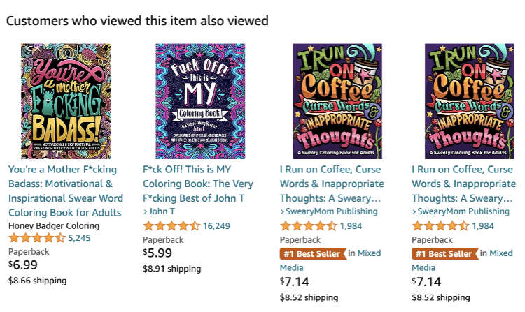
A quick glance at Amazon reveals a plethora of coloring books featuring text, with some focusing predominantly on adult-themed content. These books have carved out a lucrative niche, and researching this segment can result in a successful book that will pay you royalties for many years ahead!

Selecting the ideal background
Before we delve into the text, it’s vital to harmonize your background image and text treatment, offering a visually stimulating experience to the colorist.
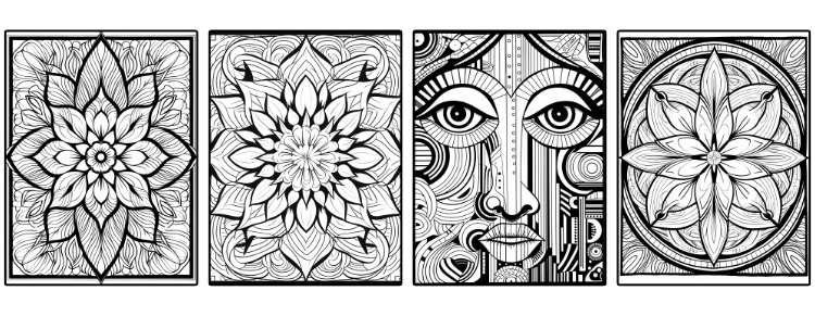
Basically, you want a nice patterned background. And, to do that, I choose Midjourney. You can see here in my article, My Best Midjourney Prompts for Print on Demand, use this sort of prompt to get the backgrounds:
/imagine: a printable black and white coloring page featuring a simple symmetrical pattern background, clean line art --ar 3:4
With all your background patterns created, selected, edited and upscaled (I use Upscayl), you’ll now need to add the text. I’ll show you how to do this with Adobe Illustrator (expensive), Affinity Photo (mid-range price) and Inkscape (free). Choose your weapon!
Let’s start with Affinity Designer
Now, onto the practical aspect of adding text to your coloring pages. In this example, we’ll explore the functionalities of Affinity Designer, although Adobe Photoshop can serve as an equally effective alternative.
In the above video I show you how to put text on an image with Affinity Designer. You can use the Midjourney pattern as a base and then add text by using the Type Tool from the toolbar on the left (hit “T” on the keyboard). Then, just type! Use ChatGPT to suggest short slogans or sayings that will resonate with the audience of the coloring book.
But, that’s not all!
The text doesn’t always have to be on a straight line. In Affinity Designer, you can get text to run along curves drawn with the Pen Tool (P) or shapes drawn with, for example, the Ellipse Tool. Again, these tools can all be found on the toolbar on the left.

In the above YouTube video, I’m aiming to incorporate text within the sun’s circumference in an image background by using the above mentioned tools.
Use the Ellipse Tool to sketch a circle roughly mirroring the sun’s size in the image. Grab the Artistic Text Tool to insert your text within the circle, adjusting the text size and tracking to avoid letter overlap.

Refining text with Adobe Illustrator
For those using Adobe Illustrator, the process mirrors the one described above. But there’s even more you can do.
We start, as before, by first importing the edited and upscaled version of the Midjourney background pattern, or whatever image it is, by selecting File … Place from the Illustrator top menu bar, and placing the image on a letter sized Illustrator document.
And then, similarly, type the text with the Type Tool (T). Once the text, font, size, and treatment has been finalized, we should then covert the text to curves. Do this when the text is selected with the Selection Tool (V) and, from the top menu bar, select: Type > Create Outlines.
Attention: the moment you change the text into outlines, you lose the ability to edit the text. It’s is no longer text, it’s paths, or vector. Now you can play around with the letters in the text you’ve typed.
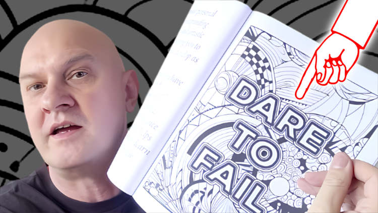
In the above YouTube video, I introduce a stroke to the text. A “stroke” is the outline of a shape, as opposed to the inside, which is refered to as a “fill”. Usually, with these coloring pages with text, the text will have a “fill” of white, and a “stroke” of black. Alter the stroke weight (width) in the Stroke Palette (if you can’t find it, you’ll find it under “Window” in the top menu bar).
The next step is to create an offset path, adding a layered effect to the outline. To do this, with the outlined text selected with the Selection Tool (V), choose Object > Path > Offset Path.

With the offsets, it’s good to choose an offset that is the same or a little bit more than the stroke size of the text you original typed.

In the above example, the stroke size (weight) of the original text is 2 point. I have offset that by 3 points. So an outline of the outline fits nicely outside, also with a stroke weight of 2 point. You can offset this path as many times as you want.
Feel free to explore various stroke sizes and offsets, crafting a design that aligns with your artistic vision. Here is a coloring page that I created, printed, and then colored in myself. 🙂

It can also be done with Inkscape
People are always complaining that design applications are expensive. Adobe products are overpriced. And, so is Canva, if you use the premium version month after month. But, in this example, we are using the free option, Inkscape.
But, beware, as it’s free, Inkscape is also not as user-friendly as the other premium options mentioned (Photoshop, Illustrator, Affinity Photo, and Canva are all easier to use in my opinion).
Watch the above video to find out how to add text to an image and export it in Inkscape.
Realizing Your Artistic Vision
As a general rule, selecting a complementary or harmonious font is paramount. Usually, a broad font creates a striking impact. Opt for a font that not only aligns with the image but also prominently stands out within it.
Experiment with the stroke size and positioning (either inside or outside the text) to achieve the best visual outcome. The ultimate goal is to harmoniously integrate the text into the image, creating a cohesive and original design.
Once your design meets your expectations, you can either export it directly from the software or transfer the path information to another application. The end product is a distinctive and personalized coloring page that offers not only a beautiful canvas to color but also conveys an uplifting message.
Conclusion
I trust this guide will spur you to experiment with textual elements in your coloring pages, adding a fresh perspective to your KDP coloring books on Amazon. Remember, the hallmark of a successful coloring book lies in a fusion of creativity and intelligent keyword/niche research.
But, as ever, what do you think? Are you going to be making coloring books with text on them? What sort of content would you like me to create?

Wow! Great content as always.
Thank you, Dennis.
Hi. Thanks for this post. I just created my first adult coloring book and am in the process of waiting for Amazon KDP to approve it.
Wish me luck!!!