More and more of our online experience is being accessed by handheld devices.

Many of us have been stuck with a website of maybe 900 to 1000 pixels wide which smaller devices would reduce in size. The mobile users would have to constantly zoom in and out to access various parts of the site (read: navigate away from the site never to return!)
Should your website be responsive?
In a word, yes. A web design should respond to a visitor’s needs rather than the other way round.
I know of no other single website tweak that I’ve made in the last 6 years that has meant over 100 more visitors daily, but this is what happened after I installed the Genesis Streamline theme:
Is your website responsive to handheld devices?
The simplest way to test a website against different sized screens is to simply re-size your browser’s window and see what happens. Go ahead and narrow the browser window on this website and see the design respond to the width of the browser.
Have a look at this great free tool to test your website’s responsiveness. Yes, “responsiveness” is a word, just not a very nice one.
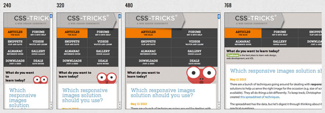
One of the best responsive websites, in my opinion, is Chris Coyier’s CSS-tricks.com, here it is on that tool:

And here is this website tested with the tool:

If you’re seeing any horizontal scroll bars with your site, you might start thinking about responsive design.
How to make your website responsive
Well, I cheated! I simply installed the Streamline theme by Genesis and tweaked accordingly. I also like the Eleven40 theme which has a much wider design on the monitors that can handle it of, guess, 1140 pixels! These are affiliate links, however there are many free responsive WordPress themes out there.
However, there are a couple of changes necessary to make a website responsive. This isn’t the only way of doing it but it is the best and simplest I’ve come across.
First of all you need to add this to the head to stop the iPhone from scaling the whole website to fit it’s screen.
<meta name="viewport" content="width=device-width; initial-scale=1.0">
Other than that it’s a question of adding media queries to your CSS to adapt your website to different sizes of browser window.
CSS media queries
In your CSS you need to change the styles of different elements as they adapt to different widths. This is, strictly speaking, “adaptive design” but I think people are more comfortable with the term “responsive design” so that is what I’m using to describe this process.
This website is 960 pixels wide when viewed on a large monitor. If the site is viewed on a device narrower than 960 pixels the design would be inappropriate, so the first media query we add is for 960px.
The whole website is sitting within a containing div called #wrap.
#wrap { width : 960px; margin: 0 auto; }
This #wrap div, along with many other elements, is set to change as soon as the browser window narrows to less than 960 pixels wide by this media query:
@media only screen and (max-width: 960px) { #wrap { width: 100%; margin: 0; } }
So now the website will squeeze or stretch to fix the width of the browser if it is less than 960 pixels wide.
But you also have to make sure that other elements of the website behave the way you want them to. So, similar to the #wrap div, both the div containing this article (.content-sidebar #content) and the sidebar (.sidebar) have specified widths in the main CSS…
.content-sidebar #content { width: 642px; }

.sidebar { width: 316px; }
… when added together they come to less than 960 pixels – the width of the website – and so appear next to each other. And when the browser is narrower than the width of the website they change to 100% …
@media only screen and (max-width: 960px) { .content-sidebar #content, .sidebar { width: 100%; } }
… so the sidebar (coming after the content area in the HTML) drops underneath the content area when using the portrait iPad, for example.
And there are numerous other changes you can make. For example, once this website is viewed at a width of less than 960 pixels, the logo in the top left moves over to the center and the social media icons top right disappear, the sign up form at the top of the sidebar disappears to avoid too much repetition of this element, and the logo changes to a narrower version for devices not wider than 300 pixels:
@media only screen and (max-width: 300px) { .header-image #title-area { background: url(images/logo-symbol.jpg) no-repeat top center; } }
You can add media queries in at any width, 240px, 320px, 480px, 768px, 960px and 1024px, are the most common. But I was thinking mostly of the portrait tablet width (around 760 pixels) and a portrait smart phone (around 320 pixels).
Images and video
With responsive sites everything has to respond. Getting the images to size to the window is easy, put this in the main CSS:
img { height: auto; max-width: 100%; }
And for the videos, I used a WordPress plugin called FitVids.
What you can do
Making my website responsive was actually ten times less painful than I thought it would be. I’m no hard-headed code geek so if I can do it you certainly can.
I’ll be writing more on this topic soon with a video. Also there are great article here about responsive web design and media queries by Chris Spooner.


I’m a big fan of responsive design (and Studio Press!), but it seems that one problem it has is the inability to view the full site. If I get shipped to a special mobile site, I can usually select an option to view the full site. In the case of responsive design, I think I’m stuck.
For example, if you have some cool widget in your sidebar that I want to show my friend, it’s (seemingly) literally impossible to do so if I’m on my phone. Granted, that’s a rather narrow use case, but could be a problem from time to time. Thoughts?
Hey, Mickey, that’s a great question. I’ve left a question on the forum at Studiopress and let’s see if I get an answer. Personally, it wouldn’t worry me if you couldn’t do that because I’m pretty happy that the mobile visitors wouldn’t want to see the full site as they’ll easily get what they want with the mobile version – the sidebar widgets are all visible underneath the contents of the page, you just have to scroll down to view them on the mobile versions. But I get your point.
Hello Mickey, Studiopress have just got back to me to say that this can’t be easily done. But they make the point that it’s unlikely that any mobile users would want to see the “full” version of the site as they still get the full site, just rearranged, ie. the sidebar is underneath the main content rather than on the side.
Cool, good to know. I hadn’t realized the sidebars moved to the bottom, which essentially solves it.
Yeah, that’s why I’m so wedded to responsive design and CSS media queries. I think it’s the way to go with website design for mobile, tablet and monitor. 🙂
Hi Rob. Thanks for this article. I have been a bit lazy and used WPtouch for my site http://www.hollywoodcat.co.uk – although you cannot preview it by resizing the browser window.
I really need to code a responsive site from scratch and will give it a go soon using your article and some pointers from the html5 boilerplate.
Thanks again for your clear and easy to read articles.
Thanks, Jean, I’d been using WP Touch for years myself.
Let me know how you get on or if you want any help. It’s probably best to experiment with it on a test site or on a localhost first.
Check out bones responsive starter theme. It could cut your time rather than building from scratch. I am using Bones for Genesis, and i love it. Only $ 5 bucks. Bones as a stand alone theme is free!
Thanks for that, I was unaware that third parties made child themes for Genesis. $5 … nice!
Hi Rob, I’m still getting to grips with WPtouch and using the free version so it will do for now.
Just out of interest, why did you stop using WPtouch?
Cheers
There’s nothing wrong with the free version of WPtouch it just isn’t customizable enough for me. With a responsive site like this one now I can get the mobile version look exactly how I want it. 🙂
Oh no Rob. I was rather hoping all this responsiveness design stuff would go away. I can see me managing it will a few little sites I run, but I would not know where to start with our own eCommerce site which is ready for a redesign.
I’m wondering if we would see any extra sales. I’ve seen articles saying eCommerce should use responsive design, but they talk in general terms about traffic which is not really evidence that people do buy on more complex sites with delivery details to fill in and lots to browse and emails to check. I can see lots doing price checking on items found everywhere or buying on Amazon as a returner, but even if we get our bit right I’m not sure if PayPal will (which most of our customers choose).
I seem to have got all ranty. BTW great article again!
Thanks again, David. I hate to say it but I don’t think this responsiveness is going to go away. But it’s amazing how easy it is. You can just get things to go on top of each other and have a width of 100% for mobiles. The CSS media queries that control the responsiveness of this site only run to about 20 lines. But, with all the other things we have to do, I know.
Interesting.
I use Thesis theme and just yesterday they released a responsive theme for free.
It’s the second time in two days I hear about responsiveness, I guess it’s time to do something about it.
I would recommend it, Cristina, it definitely helped my site reach a new audience. Thanks for popping by.
Hey Rob, That’s a great article! You did a great job explaining responsive.
Other than being more mobile friendly, why do you think going responsive helped increase your traffic?
Well, tablets, in a word. By far the most common devices that visit this site (apart from computers) are iPads and iPhones. Have a look at the stats – from the last couple of weeks – because there are some names here I don’t know:
Why they increased so much since I put the theme in? I don’t know. Very happy they’re here.
And, thanks for the comment too, Charley, welcome to the site!
Another great post, and another thing for the to-do list 😉 I’ll be back!
Somehow the to-do list is never to-done!
Thanks for the screenshot. So interesting! Our iPad figures are 4 times higher than our iPhone numbers. Above I questioned responsive design for E-commerce partly because of my numbers and also that iPad users already shop with us without it.
My head is hurting even more since Jakob Nielsen has caused a bit of a stir implying that building sites for differing platforms may still be better than responsive. Time to lay in a darkened room!
Yeah, I don’t really understand why iPad visitors should increase on responsive sites when they can pretty much see everything a laptop can see when held in the landscape position. My, according to my stats, they do!
In my opinion, building sites for differing platforms may be better than responsive, but responsive is quicker and easier!
I could do with lying in a darkened room right now!
Thanks heaps for this post it has helped me. Have a look at my mobile site, used a lot of this information.
Glad the post helped, Ricky, I’ll be writing more about responsive sites and WordPress soon. Can’t see your site at the moment, will look later. Thanks.
I also made my thesis theme responsive and result is pretty good 🙂
Looks really good, Ammar, I hope you get more visitors from smart phones and tablets.
Great article Rob, used catalyst framework to build an eCommerce responsive wordpress store .I found responsive design is quite addicting to implement and it looks cute on iphone too.
You’re right Jefrey, it is quite addicting. I’d never heard of Catalyst before! Thanks for the comment.
Is there a way to get me site to look the same in portrait and landscape on an iphone? I like how it looks on my computer and ipad but not on an iphone, please help im relatively new to this, thanks
Hello Chris, I see you are using the Agency theme by Genesis – it looks great! You can amend how your site looks on an iPhone by editing the styles within the
@media only screen and (max-width: 300px) { }declaration in the CSS file. But you have to know CSS for this. More about making a website responsive on Genesis here.Thanks for sharing these great tweak.. however i wish i know how to really tweak it on static WP theme…. I have a wp static job site that id wish to tweek… but i cant set the tweek.. other than pay dudamobile for it mobile version… and if i had to consider the countiniuos money paid monthly to get the site stay mobile… i wil say that suck.
thanks a lot for sharing this.. i will play along a little with it.. i pray it works
You need to get a responsive theme, Abiodun.
Okay okay, this my last shot of learning responsive design or else i will hang my self, after 45 days of struggeling..
the thing is i find many good guides as this one but im stuck with one question thats simple but cant find it answered in any guides.
Where do i paste all these codes in? After pasting : in my header.php ( THIS IS OPENCART INDEX.PHP) then i dont know where to paste the rest ?
IN CSS ? HTML ? where to paste media queries ? yeah im not a pro and still learning please guide me..
Shino, put this all in your CSS. There should be a link to your style.css or something similar in the head of your HTML or in index.php – so you should put all the media queries in the CSS not in the header.php – it’ll make things more organised. If you want to do a video course on responsive design using WordPress and Genesis let me know. And don’t hang yourself!
Rob,
you say that its ten times difficult to make responsive website.
is the same statement applicable if we install streamline like themes.
what about making static websites responsive. ie non php/wordpress websites .
regards
vinodh
Hello Vinodh. Well, it’s certainly easier when you use themes like Streamline on Genesis. But it’s perfectly possible to convert static HTML sites to responsive sites if you follow the above rules. It could take a while though. 🙂
Thanks for sharing, Rob. I have been using the WeaverII theme that is responsive by design. There is a free version but I have an unlimited Licence as the paid for version offers far more control. Have you looked at that theme? I know you favour Genesis but your other followers might like to look at this one.
Thanks again. Garry.
Hey, Garry, yes I’m rather wedded to Genesis at the moment, I’m afraid. Looks like a great theme though. Thanks for your comment.
Hi Rob,
Would you please tell me that im building my website on html so how i can make my website responsive?