Although many over-sensitive designers may wince at the very mention of the words “Microsoft Powerpoint”, the fact remains that many of my clients have to use it.
Powerpoint is as ubiquitous as it is unpopular. Just because you are using what some consider to be an instrument of torture, doesn’t mean that you can’t be kind to your victims.
Here are 12 of the most common design pitfalls my clients fall into and how I dig them out.
Using bullet points
To be honest, I’m not a big fan of bullet points, period. Did you know Steve Jobs never used bullets on his presentations, even when he was listing features? Powerpoint brought bullet points into the world, we’re probably better off without them.
Solution: Introduce your list items as just text with an obvious space in between.
Relying on the default slide themes too much
We’ve all seen them too many times! The Powerpoint default themes are usually horrendous.
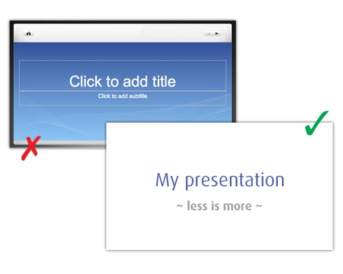
Solution: don’t be afraid to have no theme at all. Just use a blank white screen with type and images.
Making text too big
Powerpoint slides are going to be projected on a big space. There’s no need to enlarge the text to fill the available space. Increase the white or “negative” space on your slides.
Solution: you guessed it, make the text smaller!
Not using images
Don’t fill a slide up with text. That’s ugly.
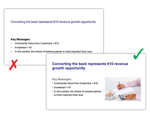
Solution: format text properly so there’s a difference between the heading and the body text. Make it large enough to be legible but small enough so you can add an image.
Over-use of clipart
Or should I just say “use of clipart” is a Powerpoint crime against design.
Solution: don’t use clipart.
Illegible text
I’m all for being creative with slide design and overlaying text on images, for example. But when you’re doing so, handle with care.
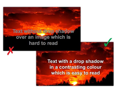
Solution: first of all, choose your images carefully, make sure they have plenty of negative space over which to put the text, so it has a consistent background to be read over. Secondly, set the color and size of text so it is illegible. Lastly, add a drop shadow to the text to further aid legibility.
Illegible and ugly graphs / diagrams
Clients like to bombard their audience with evidence to make a point. But more than one diagram or graph per slide is usually overkill. Plus you need to improve them visually.
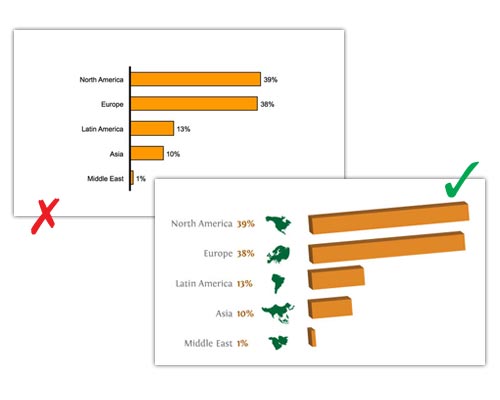
Solution: if you have to show a diagram, fill the whole slide with it and, if possible, export the diagram and improve it in Illustrator or Photoshop before importing back into Powerpoint.
Ugly slide transitions
Don’t be tempted to experiment with anything too distracting like “Checkerboard”, “Honeycomb” or “Flip”. Or, even worse, choose different transitions on different slides.
Solution: stick to a simple one like “Fade” and have it the same. Wow them with your content, not your transitions!
Using bullet points on single phrases and misalignment of text boxes
Bullet points are there to denote an individual item in a list. Therefore there should never be just one. Just one bullet point? What’s it there for? What is it communicating to the viewer? Nothing.
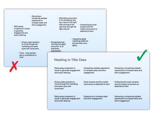
Solution: Format text > Bullets & Numbering > None. Arrange > Align or Distribute > Align left (or) Distribute vertically. And breathe.
Over branded
There is nothing worse than sitting through a presentation where every slide looks like the side of a Formula 1 car.
Solution: don’t put your logo on every slide. Mix it up a bit. Vary the position of the logo. Sometimes leave it out altogether.
Using too many colors
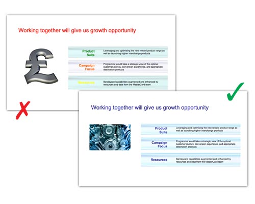
Solution: use two main colors, one primary and one secondary and then use one tint of each when looking for complimentary colors. Add images to enhance and add color to slides.
Wrong format
This is not always the case but, I think the 4:3 format is beginning to look dated.
Solution: if you’re not sure and, especially if you are doing video, go File > Page Setup > On-screen Show (16:9).
You can do it
You can produce an attractive, well-designed Powerpoint slide deck without condeming your audience to “death by Powerpoint”.
Remember, the slides are a visual aid to your presentation. They don’t have to tell the whole story – that is done by the presenter. So my last piece of advice is this – keep it simple.

Author you have gathered great points it will very helpful for creating better power point presntations.
Thank you, Larissa.
Ouch… I’m terrible at creating slide presentations and even worse speaking through them but after this, at least now I know what to do for the next time, thanks Rob!
Sergio
Ah, it’s all practice though, don’t you think, Sergio? I hope this may help you with your presentation and Udemy courses 🙂
Awesome Rob!! 😀
I’ve learned a lot on your Powepoint tutorial. Its been awhile, the last time I’ve used this application is back in college when I had to do a LIVE speech presentation on my research paper on Microbiology.
Btw,why would you not to use bullets?
Angela
I’m just being snobby about bullets, Angela. It’s OK to use bullets, really, but not on single lines of text. I quite often get asked by my clients to improve Powerpoints – it’s not my favorite job 😉
With every presentation that I design, I make sure to reexamine what the purpose of a presentation is. Garnering the attention of an audience today is a much different task than yesterday. I like to think that bullet points, insanely large text and wacky tacky clipart was supposed to serve as an example of how you can combine all of these elements into one cohesive visual demonstration, so with that in mind, my aim is to captivate viewers with something different and though provoking for sure!
I’m sure I’m being snobby about bullet points but, clip art I really don’t like 🙂 Examining the purpose of the presentation is key, true. Thank you for the comment.
Thanks for this Rob. Very timely article for me as I am doing a presentation next week using the LibreOffice version of Powerpoint. I am a big fan of keeping it simple and including some basic key points. I can then waffle to my heart’s content without having to memorise my waffle – comes across as more natural and engaging, in my opinion.
I did a presentation the other day and I didn’t read out what was written on the slides, I just used them as a visual aid to what I was talking about. Nerve-wracking, but OK! Totally agree with you that this is more natural and engaging. Best of luck for next week, Jean!
Great article Rob, and I agree with most of the points you raise. However I can’t agree with your spelling of the word ‘wince’ in the first para ; )
(‘whinse’?? Where did that spell checker go to?!)
H’mm, I don’t know how that happened. (Red face!) Thank you for pointing that out, Mike. And I’m glad you liked the article. 🙂