
The internet is daunting, disorganized and idiosyncratic. Web designers should try to make the user’s journey as simple and as pleasant as they can. What’s more, there are certain actions that webmasters would like visitors to perform – to go to a page, to submit some information, for example. For these reasons, knowing how to design and code a beautiful web button is an essential skill for web designers to have.

Sometimes we’ll mock-up a web page design in Photoshop first before creating it with code and mark-up. The two operations are quite different but have the same effect. Firstly, I’m going to show you one way I’ll make a web button in Photoshop. And then I will explain how to reproduce the exact same visual effect using HTML and CSS.
How to make a button in Photoshop
First of all create a new document in Photoshop, making sure the color mode is RGB and it’s 72 ppi.
Then in the Tool bar (on the left-hand side, usually) select the Rounded Rectangle Tool.
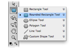
And then in the Options bar (at the top, usually) set the Radius to 5 pixels. The larger the radius the more curved the corners. You will specify this value later in the CSS.

Now you can draw your button by clicking and dragging (with the Rounded Rectangle Tool selected). Don’t worry about what color it is as we will set this using Layer Styles effects in the Layer Palette.
So, once you’re happy with the shape, with the rounded-corner rectangle layer selected, click on the effects icon at the bottom of the Layers palette which is a lower case bold italic fx. Choose any of the options in the resulting drop-down menu and this will open the Layer Style dialog box which hosts a bucket-load of Photoshop goodness!
It doesn’t matter which style you work on first but let’s start with the gradient. Click on Gradient Overlay on the left-hand side of the dialog box.
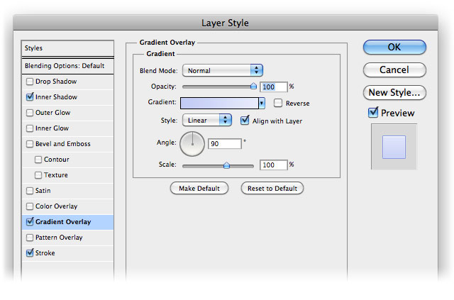
Set your gradient by clicking on the, er, gradient and then choosing two colors in the Gradient Editor.
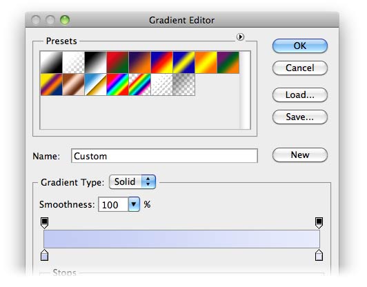
By clicking on the “color stops” at the beginning and end of the gradient, and then clicking Color underneath, you can eventually choose colors from the Color Picker. (Maybe one too many clicks here, Adobe!) The important thing here is to click to shades of the same color that are quite similar, so that the gradient isn’t too steep.
Next, let’s do the Stroke or border. After OKing everything, click on Stroke on the left-hand side of the Layer Style dialog box and, annoyingly you’ll get a default red border of 3 pixel. (How about making this default to 1 pixel, Adobe!?)
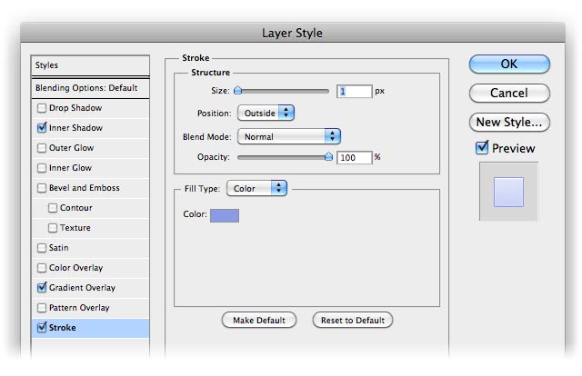
So, change the width to 1 pixel and pick the color of the stroke or border. It’s sometimes nice to make it the same color as either the beginning or end of the gradient. In this case the darker of the two colors.
Finally, we want to give the button a subtle one-pixel highlight on the top, under the border. This can be done by making a one-pixel high selection on a different layer but you can do it within the Layer Style dialog box as well. Click on Inner Shadow on the left-hand side.
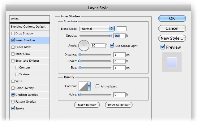
Now, usually shadow styles are dark but they can provide glows or highlights. Click on the black rectangle after the Blend Mode drop-down and change the color from black to white. Choose Normal for the Blend Mode (you won’t see white in Multiply). Make sure the Angle is straight up 90º and that the Distance and Size are 1 pixel.
This is really subtle and you can barely see it on this lighter example (the left-hand one of the buttons at the top of this article. But on the darker one it is more noticeable. Either way, this one-pixel highlight at the top of a button gives it a slight 3D effect that will make the visitors love to click on it and your client happy to hire you again!
That concludes the styling for the button, now for the text.
Get the Type Tool (T) from the Tool bar and click on the Photoshop document where you want the text to go. Type your text: “Click me”, in this example.
Use the Options bar to select the font, color and size of the text.

To give the dark text a glow under it and the light text a shadow under it we can choose Drop Shadow from the Layer Styles dialog box.
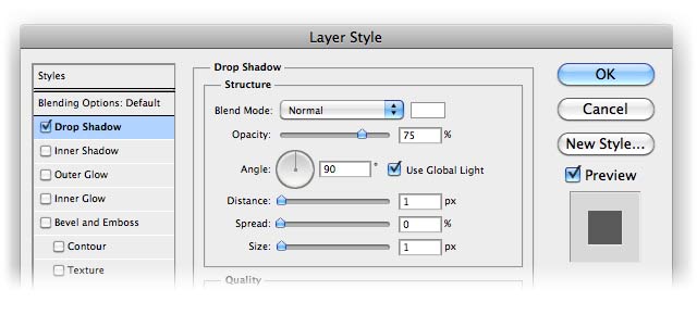
Again on the left-hand example on the top, we want to give the text a subtle highlight underneath it so it looks like the text is slightly indented into the button. To do this we, change the Blend Mode to Normal and change the color from black to white. Make sure the Angle is straight up 90º and that the Distance and Size are 1 pixel. (For the example on the right, the Blend Mode will be Multiply and the color a very dark blue.)
And that’s how you do it in Photoshop. After your client has approved the design of the buttons you shouldn’t just save the image out as a JPG and source it in the HTML. You should use CSS to style up the element (which may be input or a p class or an a class).
How to style a button in with CSS
Here I will give you the styles, for the button below which is similar to the one up top but with slight smaller text. (If you’re reading this on an RSS feeder, by email or on a scraper site, you won’t see the following button so you best check it out on the website).
Here is the HTML for the text example immediately above. However, most of the time, buttons are marked up with the input tag.
<p class="button"><a href="">Here is the button styled in CSS</a></p>
Before you can start on the CSS you need to go back to the Photoshop document. Zoom in to your button and select with the Rectangular Marquee tool (M) a one-pixel wide selection. The height will be the eventual height of the button. You may like to take the Stroke off for this as it may complicate matters and you will be setting this in the CSS.
![]()
Cmd/Ctrl-Shift-C to Copy Merged the sprite and then make a New Document in Photoshop (Cmd/Ctrl-N).
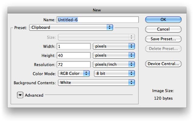
The size of the new document will be the size of the sprite you just copied if you have Preset set to Clipboard.
Paste the 1-pixel wide background gradient into the new document and Save for Web & Devices (Cmd/Ctrl-Opt/Alt-Shift-S) as a fairly good quality JPG to avoid banding.
The other information you want from the Photoshop document of your button visual is the HEX value of the button’s Stroke or border and the HEX value of the text color.
And here’s the CSS.
p.button {

background: url("path/to/1px-wide-background.jpg") repeat-x #C2CBF4;

border: 1px solid #C2CBF4;

border-radius: 5px;

moz-border-radius: 5px;

-webkit-border-radius: 5px;

-khtml-border-radius: 5px;

font-weight: bold;

padding: 5px ;

text-align: center;

font-family: Helvetica, Arial, Tahoma, sans-serif;

font-size: 15px;

font-weight: bold;

line-height: 24px;

width: 350px;

}
p.button a {
text-shadow: 0px 1px 1px white;
color: #4E5FAB;
text-decoration: none;
}
Notice the background has a color as well as a background image (gradient) this is for people who browse without images.
Every button should have a hover state
Every link or button on a web site should change itself visually when the user’s mouse is over it. This gives the user the impression that it is a “live” or “active” area of the screen and therefore will do something if clicked, otherwise it’s just inactive text or imagery.
So make sure you set styles for the hover state.
p.button a:hover {

text-decoration: none;

color: #6E80D0;

text-shadow: 1px 1px 1px #fff;

}
p.button:hover {
border: 1px solid #8b9be4;
}
In this particular example the background gradient of the button doesn’t change on the hover but it should do. You can do this by doubling the height of the background sprite by creating a lighter or darker strip of pixels underneath and changing the background image’s y co-ordinate to show the different pixels.
p.button:hover { background-position: 0 40px; }
Here the background image will be moved up by 40 pixels when hovered over, showing the lighter or darker pixels. 36 pixels being the height of the button.
But I’ll do a proper sprite tutorial on another day!
Other tutorials
I have another tutorial about more bulging, shiny, jelly buttons. Here is one for a cool, shiny, web 2.0 button.
And, here’s another tutorial about how to create cool shiny buttons in Illustrator alone.
Let me know what you think
Any other top tips for web buttons? I would love to hear what you think in the comments down below. Plus, please feel free to vote for this article with a Tweet, a Like or a Plus One!



Check out this to do the same thing directly on the web an receive the CSS. The app is not yet feature complete (for example the gradient editor is buggy), but the aim is to create web-elements without images but with the same comfort we have in graphic editors.
Ups, i forgot the link: http://layerstyles.org/
Great, thanks for that link, Felix, 🙂 that would be great if it could output button images and CSS as well. Maybe that’s to come.
It does output CSS code – just click the button in the bottom left corner to reveal the css code. It doesn’t need to output images, since it uses purely css gradients which are supported by all modern browsers.
Wow, Felix. That is a truly awesome bit of open source software. I have a few comments though.
1. It should say that you can resize the object, it’s not immediately apparent
2. The code button should be more visible. It took me ages to find it even after you told me where it was.
3. OK, I’m being ultra-greedy here but it could have a text editor on it to create HTML text for a button with text shadows and colors, etc.
4. Don’t you have to put a back-up background image style for IE? Or do you not bother with IE?
Comments 1-3 are obviously not meant as criticism as this is a potentially ground-breaking bit of open source which puts the WYSIWYG back into web design. As the creator of this, Felix, you deserve all the plaudits that come your way. I can see this making the top 10 of many web designer’s favorite open source products out there!
My only note of caution is the IE issue, however, even with that I can see myself using this A LOT! Thank you very much!!!! 🙂 🙂
Wow, thanks for your elaborate response, Rob.
1. resize hint: how would you hint to that functionality? I want the interface to stay as clutter-free as possible.
2. code button visibility: yes, already several people pointed that out. I updated it (made it black and white for now – i’ll have to look for a long-term solution – maybe integrate it into the main editor as a button next to ‘new style…’) – hard-reload the page http://www.layerstyles.org/builder.html
3. I have a hard time understanding this comment. Are you talking about a html input field to change the demo-html the css is applied to (currently its a plain )? my idea would be to have layerstyles as a bookmarklet in the future to pick one ore more elements on a website you’re currently working on (with a given html code) and then edit said element’s css (like a visual firebug thingy).
4. the easiest fallback would be a plain color. I only thought about that, but didn’t implement it yet.
Hey, Felix.
1. Re-size hint. I understand about keeping the interface clutter-free. Opposite the main editor?
2. Code button. If you have a large screen it’s very easy to miss. Either on the main editor or opposite the main editor?
3. Sorry not to be clear. I mean you could make it or make another one to create buttons with text, like in the example above or hear for the “Post Comment” or “Reply” buttons you could create a WYSIWYG editor for the text applying color, text shadow and other styles and then provide the CSS for that as well as for the panel beneath it.
4. I guess a lot of people wouldn’t be too bothered with IE fallbacks.
Anyway, it’s an absolutely fantastic resource, Felix. You’ve done so well.
Rob,
This is some cool stuff. I am such a graphics Newb! But I am slowly learning. I bookmarked this page to come back later. (and I also went and bookedmarked the shiney button one…which looks simply awesome and I had not yet seen)
Thanks,
Steve
Hey, Steve, thanks! You know if you ever need any help with graphics you can always ask me! 🙂
Great tutorial Rob! I am a complete novice at web design (usually hire others to do it for me), and had no idea that the button styles were controlled by css. I always assumed all buttons were fixed images.
Thanks Alex. It’s better to do buttons with HTML and CSS rather than with just images as (1) SEO-wise the search engine spiders better understand what the button does and (2) it can be read quicker by the browser therefore improving page speed by a fraction of a second! 🙂
Hi Rob great post with good detail I have just wrote a post on doing the same thing with no use of images take a look 🙂
Of course IE does not render it 🙁
That’s a fantastic post (and the whole site is looking much better centring-wise).
You have a flat background color fix for IE but would it be possible to have a repeat-x sprite for the versions of IE that can handle it? It’s a lot of work for only a minority proportion of visitors but it would be another fall back none-the-less.
Plus, have you seen Felix’s http://www.layerstyles.org here in the comments?
Cheers Rob 🙂 Yeah it was one of those “to-do” jobs glad it is done now!
You can use an image too target IE I should have done it for the post but I … Well… You know, IE has had plenty of my time over the years and I was not going to open Photoshop, slow my PC just for people who use such a rubbish browser. (Of course if this was for a client I would of) :p
Yeah I took a look what a clever piece of kit 🙂
I understand 😉 haha!
jQuery and no images used.
Thanks for the link, WD.
Thank you for the walk-thru! Creating buttons is the bane of my existence. =) I usually just buy them from a stock photo company. It’s nice to have a tutorial on days when funding is low.
You should try to style them up with CSS as it is quicker to download, Brandy. Hope this helped.
Great work. Useful discussion. Thank for the post.
No problem, Sir!