The secret of good design is to make things simple and easy. The design process starts with an idea and ends with the communication of that idea to a user or a customer.

Blog posts are exactly the same – they communicate an idea to a user or a customer. Good blog post formatting aids this communication and it’s appreciated by visitors.
Great blog post formatting is not difficult. You don,t have to be a designer or web savvy to be able to do it.
Have a look at the two blog posts below:
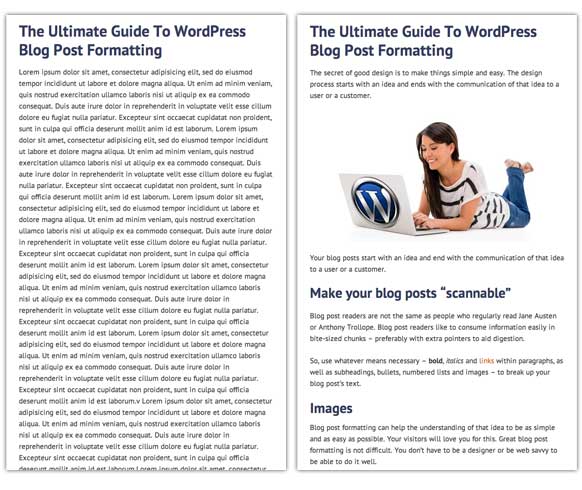
Which one looks better? The one on the left or the one on the right? All agreed? OK, let,s get going…
Make your blog posts “scannable”
Blog post readers are not the same as people who regularly read Jane Austen or Anthony Trollope. Blog post readers like to consume information easily in bite-sized chunks – preferably with extra pointers to aid digestion.
So, use whatever means necessary – bold, italics and links within paragraphs, as well as subheadings, bullets, numbered lists and images – to break up your blog post,s text.
Images
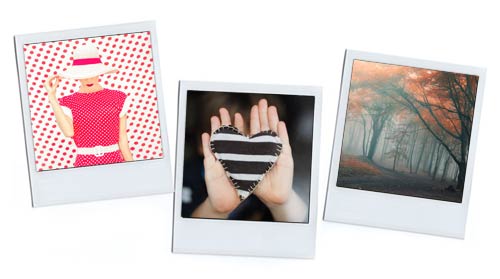
The first and most obvious way to break up your text and make your posts more attractive is to include images.
The visual use of images
Hard and fast rule: every blog post should contain at least one image, not less than 300 pixels in width. This should be inserted at or near the top of the blog post and it will be used as the featured image in your blog and on Facebook, LinkedIn or Google Plus.
Images like this (300 pixels and wider) should be centered within their own paragraph. So click the Add Media button after having hit Return (to create a new paragraph) and choose Center Alignment.
If you want to insert an image with text flowing around it makes sure the cursor is at the beginning of a paragraph when you click the Add Media button and choose Left or Right Alignment. But do this only if the image is 250 pixels wide or narrower. (See this demonstrated in the video below).
Try to use nice images. So, not screenshots of Excel spreadsheets – something vaguely easy on the eye. Try stock.xchage, RGBstock and Flickr Creative Comms search for free images.
You can use multiple images to break up the text of a long post.
Images: SEO and UI
In blog posts, images are usually used purely decorative. Try to use images creatively to draw your visitors into the article.
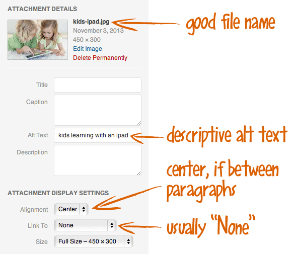
Always write a keyword rich and descriptive file name and alt text for the image. The file name’s words should be separated by hyphens. And the alt text should be as descriptive as possible and can be entered where it says Alt Text in the Attachment Details.
Usually you will never have to bother with the Title or Description in the Attachment Details section of the WordPress Media Uploader. I only use Caption very rarely.
By default the file name without the extension ends up in the Title field of the WordPress Media Uploader. This should be deleted as a tooltip appears when hovering over the image and, for me, this is unnecessary unless the image is a link.
And, under Attachment Display Settings, make sure you choose “None” in the “Link To” section. If your image can be read at the normal size there is no advantage for having it link through to a full size version of the photo. Only do this if there is a reason why your visitors would like a closer look.
The above video shows you how to insert an image into a WordPress post both on its own as a paragraph and inset within a paragraph.
Typography
All posts can be improved by creative typographical formatting. You may be happy with the typographical styles in your WordPress theme, but this won,t help you if your blog post is line after line on unformatted text.
Again, think of making the post “scannable”.
Subheadings
For me, no post is too short for subheadings.
Subheadings are great for the reader as they itemise and visually break up the content and they give the search engines a better idea of the blog post,s content.
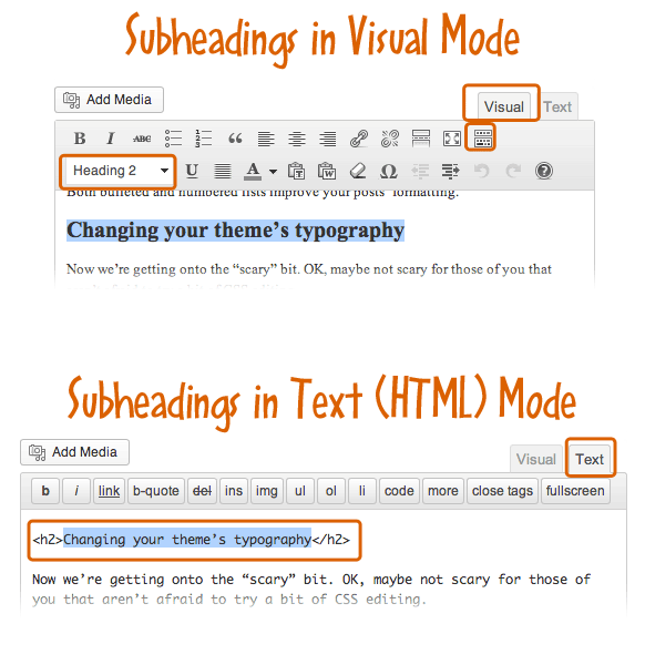
There are two ways to create subheads. Firstly in the visual editor and secondly in the HTML editor:
- If the Visual tab is active on the top right corner of your WordPress text editor, you can set subheadings with the drop-down on the second line of tools at the top. If you only have one line of tool icons at the top of your text editor, click the last one (Show/Hide Kitchen Sink) and you will see the drop-down menu which allows you to format highlighted text. Simply highlight your subheading and choose either “Heading 2″ or “Heading 3″ from the drop-down (this is assuming that your post title is an h1).
- If you use the HTML (Text tab) editor in the WordPress text editor, then you,ll probably know that “Heading 2″ surrounds the subheading in <h2> tags and “Heading 3″ creates <h3> tags. You can just type in the HTML using this editor.
Do NOT use bold for subheadings!
The above video explains how to add subheadings in WordPress posts.
Bold, italics, links and normal text
The normal text of an article (or body text) can be livened up significantly by the creative use of formatting.
How much you do this is up to you and your audience. Run your eye over a draft post,s preview and, if it,s looking a little dull, see if there are any phrases you can italicize or embolden.
Bulleted and numbered lists
We have all used bullets since the dawn of word processing. Bulleted lists serve to visually itemize a list. They are easier to read than if the list was in text form and the list items separated by punctuation.
And if the list,s items are sequential it should be a numbered list.
Both bulleted and numbered lists improve your posts, formatting.
You can do it!
You can improve your blog post formatting to make your articles more attractive, accessible and “scannable” for your visitors.
You will be rewarded with a more engaged audience who spend longer times on your site.

Hey Rob,
Thanks for sharing. I like the part you show about the alt tag. I used alt tag all the time but I got to be honest; did not really optimize it. Guess there’s a lot of work to do now!
Haha!
~Reginald
Hello Reginald, Great to see you here thanks for dropping by and leaving a comment. Filling in an alt tag with a keyword rich description is a best practice but I wouldn’t go back over all your old blog posts to put them in. Just something to think about in the future 🙂
Couldn’t have said it better myself Rob.
It is super important to make the post interesting, scannable and easy to read.
I often see posts that are text only, and I really hate slogging through them.
Well illustrated with examples and detailed tips
cheers
ashey
Thank you so much, Ashley. This is something I see a lot of people getting wrong. Cheers, Rob 🙂
Hi Rob,
Most people do not take time to really optimize their post before hitting the ‘publish’ button, most especially on their images.
I’m particularly glad about the subheading issues you discussed and the H2 tags, I’ve been naive and just getting to know this.
Thank you sharing this helpful post ( I’ve retweeted it).
Hi James, I’m glad you found it helpful. I really think it’s useful to Preview the post before you hit Publish and then try to improve it visually before “pulling the trigger”. I’m sure your visitors will love you for it. 🙂
Hey Rob,
Do those free photos you talk about require attribution? If so, what is the right way to add a photo credit?
No, Fayola, they don’t require attribution. Although you could add one if you wanted. I hope this helps.
Nice post! – great stuff all at once place – very helping and informative
Glad you liked it, Vaibhav.
Great tutorial, Rob!
I normally don’t put my text wrap around my image but you just showed us how. I should try it this way sometimes. Anyway…see you around and have a great week.
Angela
Glad it helped, Angela. It’s funny there are all these little things in the WordPress backend that are quite useful once you know.