Blogs are, in my opinion, the easiest and best way to get stuff on the web.
With a blog you can publish constantly updated information about yourself, your company or your interests to the world. And what makes it even better is that this information is chronologically ordered and categorized for search engines almost automatically.
Your blog posts should be delivered in the most beautiful and readable way to get the most out of this fantastic medium.
Here are some design essentials you can use to improve the look of your blog and your blog posts.
Body text size and line spacing
The body text is the text you are reading at the moment – a normal paragraph within an article. It’s the meat and drink of the blog so it has to be readable. Having said that it’s amazing how many websites have their body text too small. Some people will not read text below a certain size.
I’m going to stick my neck out now and say that the font size of body text on a website should never be smaller than 15 pixels or 1 em in size. Furthermore the line height (the line spacing or leading) should always be 25% larger than the font size or more. So if the font size of your body text is 15 pixels; your line height should be 19 pixels or more. If the font size of your body text is 1 em; your line height should be 1.25 em or more.

If you are not familiar with the terms pixels, ems, font size, line height, etc., or don’t know how to change them read on.
The file that controls the size of the body text on your blog is the CSS (Cascading Style Sheets) file. If you are a WordPress user it will most likely be in your theme folder and called “style.css”.
You can identify the font size and the location of this CSS file as well as previewing the changes using your browser. If you’re using Chrome or Internet Explorer you can view Developer Tools. And if you’re using Firefox you can use the Firebug extension.
While using these tools’ cursor (it can be an arrow or a magnifying glass), click on the element that concerns you and then the styles and style sheet that is affecting it will show up in the Developer Tools or Firebug panel. So, if you click on a body text paragraph you may see that it is controlled by the body element in your main CSS file.

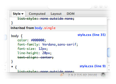
Above you can see in a screen shot from the Firebug panel in Firefox that the font size of the body text is 12 pixels and the line height is 20 pixels. You can actually change the values in this panel and the browser will render the changes live. This is a great way to learn CSS and mess around with different design elements. You can also see that the file controlling these styles is called “style.css”, hover over the file name in this panel and the web address of the CSS file will show as a tool tip.
Paragraph spacing
Paragraphs on the web should have a space between them. It should be around half the line height. So, if your line height is 20 pixels, you should add a 10 pixel gap between paragraphs. This is usually done with either padding or margin on the <p> tag. Here is a sample CSS code that adds a 10 pixel gap to the end of each paragraph:
p { margin-bottom: 10px }
Include sub-headings in your blog posts
If you are writing a post with more than a few hundred words then you should use subheadings. They improve the post for your readers as they break up and order the text and they are also good for SEO. Here is the HTML code for the above subheading:
<h3>Include sub-headings in your blog posts</h3>
As my normal blog title is wrapped inside <h2> tags my subhead text is therefore wrapped inside <h3> tags. This shows the hierarchy of headings – the subheading isn’t as important as the heading. Some blog post titles are <h1> in which case the subheadings should be <h2>.
As above, use Firebug for Firefox and the Developer Tools in Internet Explorer and Chrome to identify the title tag and then set up an <h2> tag or <h3> tag in your stylesheet accordingly. Here is the CSS for my titles and subheadings:
h2 { font-size: 23px; line-height:27px; color: #4c5464; }

h3 { font-size: 18px; line-height:22px; color: #243f76; }
Make your text scannable
Remember your visitors will typically spend a few seconds on your website so it is necessary to make them feel at ease and entrap them. So far we have talked about good body text typography, paragraph spacing and subheadings to do this. But you can also add bold text, italics, bullets, numbered lists, links, etc. to break up otherwise dull lines of text. These highlighted words jump out and may interest your readers. It also looks nicer.
Insert images
Blog posts are incredibly boring without images or video. Use them. Here is an article I wrote on how to add images to WordPress posts.
Conclusion
I wrote more about the technicalities of writing and designing a WordPress post here.
Font size, line height, paragraph spacing, subheads, images and other typographical elements can all be used to improve legibility and aesthetics in your blog posts. Have I forgotten something? Can you suggest other ways to improve the design of blog posts?


Useful advice. Thanks for sharing your knowledge.
My pleasure, Ron.
Thank you for sharing these information. I will surely check your site for more updates on blogging and to get some helpful tips such as this one.
Thank you, Jim
Rob, today I changed the font of my “standard issue” Twenty Ten from the Georgia, “Bitstream Charter” font-family to the Helvetica, Arial, Tahoma, sans serif font-family. I used this article as a guide and even used Developer Tools to look at your site’s font in order to emulate it. I was way outside my “comfort zone.” Well, the font change worked and I think it looks great! I never would have tried this without your guidance.
Hey, glad you managed to do that. You see, not as hard as you think! Maybe during these early days you should download copies of your theme files via FTP. That way, if you make a mistake you can revert to an earlier design. Happy blog tweaking!