It is becoming more and more of a necessity to have a website that is responsive to smart phones and tablets. Here I’m going to explain about how I created the theme of RobCubbon.com using Streamline on the Genesis framework.

The Genesis framework costs $60 and the Streamline theme costs $25 (you can get both at the same time for $80). If you purchase the theme through these links I receive a commission. If you do, I appreciate it and feel free to ask me any questions. Otherwise, you can purchase the products by Googling them and there’ll certainly be no hard feelings!
The great thing about using the Genesis framework is the price. You get all the advantages of using a professional WordPress framework and you can use it on multiple sites. I always use Genesis – for all my sites and all the sites I build for clients. In fact, I always build responsive sites for clients now, even if they haven’t asked for it, because the benefits are undeniable.
If you don’t want to use Streamline or Genesis, you can search for responsive themes on the WordPress theme directory.
So how do you make WordPress responsive?
Above is a video explaining how to install a responsive theme on WordPress and the first few steps to get it looking how you want.
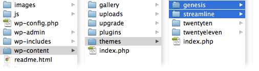
Streamline is a child theme on the Genesis framework (more about child themes on Genesis here). As it is a child theme it needs to sit in the /themes/ directory next to the /genesis/ directory that contains the Genesis framework.
I also explain in the video above how to re-name your theme by amending the style.css and functions.php and renaming the “streamline” folder itself but this isn’t necessary. Once the theme folders are in the correct place in the WordPress install, you are ready to activate the theme in WordPress by going Appearance > Themes and selecting the Streamline theme and clicking Activate.
Congratulations! Your WordPress site is now responsive to smart phones and tablets!
Changing the header of the Streamline theme
Once Streamline is installed you can go to Appearance > Header and Appearance > Background to upload header and background images.
However, I like to do this by amending the CSS. In order to be able to amend the header and background by the CSS, you need to delete the following lines from the functions.php:
/** Add support for custom background */
add_custom_background();/** Add support for custom header */
add_theme_support ( ‘genesis-custom-header’, array ( ‘width’ => 960, ‘height’ => 120 ) ) ;
Once these lines are deleted set your Header Settings in the Genesis Settings to “image logo” and you are free to style the header and background in the CSS along with everything else.
The CSS for any theme can be found in the theme’s folder and is usually called style.css. This can be edited through WordPress by going Appearance > Editor where you will see all the files in the main theme directory. However, this isn’t the best way to edit a large CSS file and you’ll probably want to use a code editor on your server to for more productive editing.
So, to add a logo image to the header you can amend the CSS like so:
.header-image #title-area { background: url(images/logo.jpg) no-repeat top left; }
Of course you have to remember to put your logo image (logo.jpg) in the streamline/images/ folder.
Changing the background of the Streamline theme
The background of the Streamline theme is actually a tiled image. Should you want to change this you should simply amend the body identifier in the CSS:
body { background: #E6E4E1; }
The above is the background color for this site. With Streamline this changes the background of the top navigation bar as well, but you can easily amend your CSS to get the top navigation bar to have a different background from the main body if you wish.
Creating the responsive elements
The advantage of amending an already responsive theme is that is cuts down the development time. Creating a responsive theme from scratch would take a lot longer.
However, I needed to make a few changes to the smart phone and tablet version to get them looking exactly how I wanted. I explained the basics of responsive CSS media queries in my other article. Here are some more specifics:
On the right side of my header I have some social media buttons that will take you through to my Facebook page, my YouTube channel, etc. Once the website is viewed by a device narrower than 960 pixels (an upright tablet, for example) the logo centers and the social media buttons disappear. (Go on – if you’re viewing on a desktop, re-size your browser window to see it working!)
The following media query in the CSS is added to the div #title-area to center the logo when the site is viewed on upright iPads:
@media only screen and (max-width: 960px) { #title-area { float: none; text-align: center; } }
So, as you can see, the media query @media only screen and (max-width: 960px) { } styles elements only if the website is narrower than 960 pixels wide.
The social media buttons were added in a text widget in Appearance > Widgets (more about styling widgets here). By using the Developer Tools in Chrome (or any other browser) you can see what unique identifier is used for each widget. In this case the div was #text-6. Here is the CSS that makes that widget disappear when the browser width is less than 960 pixels:
@media only screen and (max-width: 960px) {#text-6 {display : none ; } }
You can go on and on with this tweaking in the CSS to make sure that your site looks perfect on every device.
What you can do
If you want to change your WordPress site to become responsive I would definitely work on a copy of your site first. If you are setting up a new site to be responsive it may be an idea to work locally developing the theme by setting up WordPress on your computer using MAMP (Mac) or WAMP (Windows). In order to view how the website will respond on different sized devices, simply reduce and expand your browser window.
It’s not very difficult to do. Once you have the framework in place, creating a site for desktops, tablets and phones is almost as easy as setting up WordPress. You can do it!

It will be great if you share a tutorial on How to make any WP theme responsive.
IS that possible? 🙂
That’s a really great idea, Ammar, I explain a little bit about how to do it in this post but I could do it live in a video – that might be a really good thing to do.
Rob, Unable to click on above link, I’ve checked the source code, everything is fine but don’t know why link is not clickable.
I’ve fixed this now, Rajesh. It was missing the = after the a href! Thank for pointing it out! 🙂
Thank you Rob for this info. I am aware of genesis but not this theme.
also please inform to all subscribers when you post a video on same topic.
You’re better off subscribing to my YouTube channel, Vinodh.
OK , will subscribe
🙂
Very cool blog, Rob!!!
Btw, when you say you can use genesis for ”multiple websites” once purchased, does that mean ”for life time and for as many websites as you want”?
Thank you, Fasil. Yes, Genesis is really good value for money as it is $60 and you can use it as much as you like and you have access to the support forums for life. There’s no “user’s license” and “developer’s license” as with Thesis and other frameworks. Of course, once you’ve bought the Genesis framework, you may want to buy an individual child theme but these only cost $20 or $30. I have only bought one so far!
Perfect!! 😉
but, why would you wanna buy a child theme, Rob? And which child theme did you buy? Isn’t it my task to build a child theme for every project?
Correct! It depends on your level of expertise. I bought the Streamline theme it was useful to buy because it is responsive and therefore easier to build a responsive site by amending it. You don’t have to buy any child theme at all, you could just buy the Genesis framework and make your own child themes.
Great article; thanks! I now have the Genesis theme with the Streamline child, and I love how it looks. Just one small issue – I don’t know how to configure it so readers can see my older posts. My old WordPress theme used to have a “View older posts” link at the bottom of each page. Is there a way to offer that with Genesis/Streamline?
Thanks for any thoughts on this!
Hello Becky, that’s great. It’s certainly possible on all the blog archive pages as in the Genesis theme settings under Content Archives you can choose under Select Post Navigation Technique: “Numeric”, “Older/Newer”, “Previous/Next” – I always go for “Numeric”.
However, looking at your site from the link you’ve given here it appears that you’re using the old Streamline theme (version 1) and I can’t remember how that works so much. There is obviously a custom home page in Appearances > Editor that you should be able to edit – although with caution! Also you could post a question in the forums and I’m sure they help you amend the home.php in the theme.
Streamline is really a very creative theme and i hope that this will be most loved theme of genesis after news theme.
Thanks for sharing tips to make it responsive. I am using Streamline on one of my blog and hope this tutorial will help me to make my theme much better.
Thank you, Kulwant. Glad to here you’re using Streamline. It’s a great theme. Lots of Genesis stuff here and more to come in the future!
Thought i don’t use Gensis @Cubbon i use Thesis but i will give a try this. tnx 4 this
Let us know how you get on, Arafin.
Thanks Rob, now by default new version of this theme is responsive. I’ll use this guide to make other Genesis theme responsive.
Good idea, Rajesh. You may find that Studiopress will be creating a responsive version of earlier child themes that you have purchased. I say this because I know they updated Streamline and Magazine to be responsive recently. So you could write to them and ask them if they’ll be updating other themes. It could save you a job.
Yeah, exactly! They are releasing mobile version of earlier child themes. And I thought it is easy to make Genesis child theme mobile responsive. Thanks Rob.
Pleasure, Rajesh.
Hi Rob,
Thanks for the great post! Can you show how to amend the CSS so the nav bar has a different background color than the rest of the page?
Thanks,
Emily
Hello Emily, I’m glad you liked it. This video shows you how to amend the nav bar. 🙂
Hi Rob
Another great post. Your work has been invaluable in my learning the basics of Genesis and hand-made child themes. Responsive design is doing my head in, however. I’m going to investigate this post’s recommendations, though, and see if I can work it out. If only because it pees me off when I rotate my iPad on my sites and they don’t shrink to fit.
Thanks
Dom
It pees me off as well, Dom. Responsive design really isn’t that much harder than anything else. It’s just CSS. You can do it!
My Genesis WordPress site used to have a link at the bottom of my Home page saying “Older Posts” but it has disappeared. Can you help me figure out how to add that element back to my site, please?
Thanks!
I can’t really answer that without seeing your site from the back-end, Madge. This is controlled in the Genesis Theme Settings, under “Content Archives”, where it says “Select Post Navigation Technique:” but you should have something there.
Very informative! Do you think it’s better to buy a theme that is already responsive or is it easy enough to make a theme become responsive with some tinkering?
Glad you liked it, Sharon. It’s definitely better to get a responsive theme first and tweak that (as long as it’s a good one) rather than to make an unresponsive theme responsive – which is possible but will take you longer. 🙂
Really great post, i activate streamline theme on my blog but i m having some problems like sidebar is not showing side bar, Newsletter address change option is not available.
Hello Harshit, I visited your website and it looks like you have the Streamline theme activated on it and I can’t see any problems with the sidebar or the newsletter signup form. Could you be more specific about your issue, please?
Thank you Rob for your reply, My above mentioned issue is fix now.
I have one more problem i want to change the color of sidebar as white color,
please suggest me the way.
Either find
.sidebarin the style.css inside the /streamline/ folder and addbackground: #fff;to it, somewhere inside the curly brackets.Or, not so good, add
.sidebar {background: #fff;}to the style.css at the end.Rob i add the . sidebat {background: #fff;} in sttyle.css but it chage the the color only some part where i add the plugins.
Fixed via FB.
Thank you very much Rob..!! 🙂