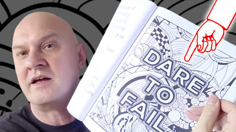
Make your coloring pages stand out by adding quotes to them.
Recent articles

Creating a Coloring Book for Amazon KDP: The Process

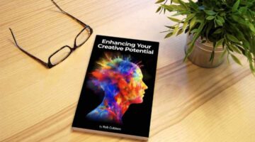
Enhancing Your Creativity in the AI Age: Reinvent Yourself for Relevance
How I Wrote My New Book With ChatGPT
Write a Non-Fiction Book for Amazon KDP with ChatGPT

How To Write Better Prompts For ChatGPT

My Best Midjourney Prompts for Print on Demand

Using ChatGPT With PoD, Amazon Merch On Demand, and KDP Low Content Books

Why Neutrality Will Improve Your Mental Health

My Thoughts On 2022

How To Live Overseas Successfully
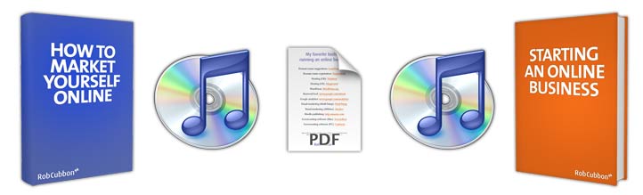
Download my 2 free e-books and 2 free MP3s on running an online business & getting clients
Plus a list of my 12 favorite resources for online business